Autoimmune Disease, Spooky Girls, and Coloring Books
Well, we're trying something a little different.
I've been going through some life changes. First of all, if it's been a while since we checked in, I live in Georgia now. (If you don't remember me at all, don't unsubscribe, I promise you signed up for this because you liked me at one point.)
I've also been suffering from what my doctor in Florida thought was an autoimmune disease. He was guessing Rheumatoid Arthritis or something similar. Which is a good guess, as it's something my father and my maternal aunt both have.
For me, it's felt like having the flu 24/7 for going on two years.
A change in diet, some daily multivitamins, and switching to red wine all seem to help. At the very least I'm not in daily pain and I can focus on creative projects again. Case in point, I'm redoing my websites, and my newsletters and writing will be published here.
You can subscribe at 1, 5, and 20 dollar levels if you choose to support me.
There is also new Merch at the bottom of the email/post, which is another great way to show support.
Visit the site by clicking here.
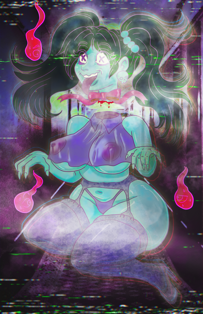
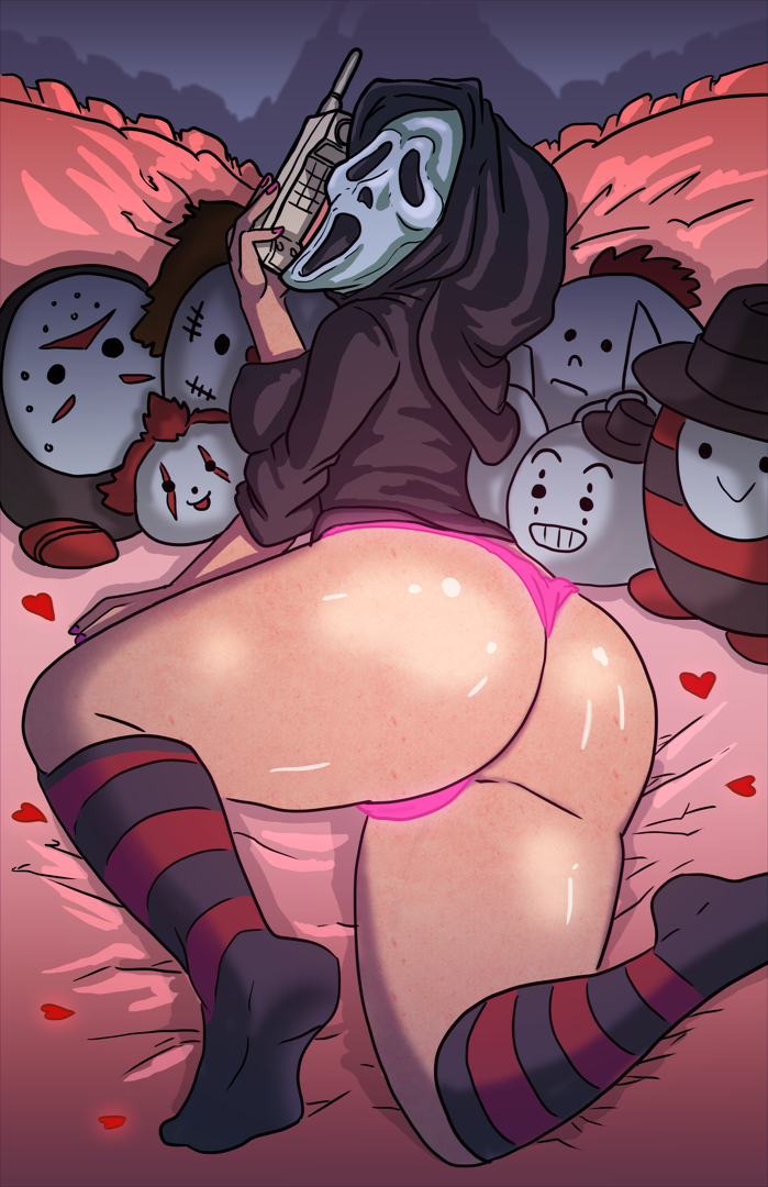
Spooky Artwork for Spooky Empire. Sadly I did not attend.
2024 was a humbling year. I went to my first long distance traveling art show in Dallas, and did my first show in the Atlanta region.
I felt like I was a good fit for both, but both were major L's.
I was scheduled for Spooky Empire, which wrapped the first weekend in November after being rescheduled thanks to Hurricane Milton. Reports from the show was that sales were down from last year, which was one of my all time best shows. I opted out, just not up to the stress of the travel given my other responsibilities.
If you want to see me at shows in your area, you can let me know by replying to this email. By all accounts, too many artists are hurting, and I may focus on other areas for a while.
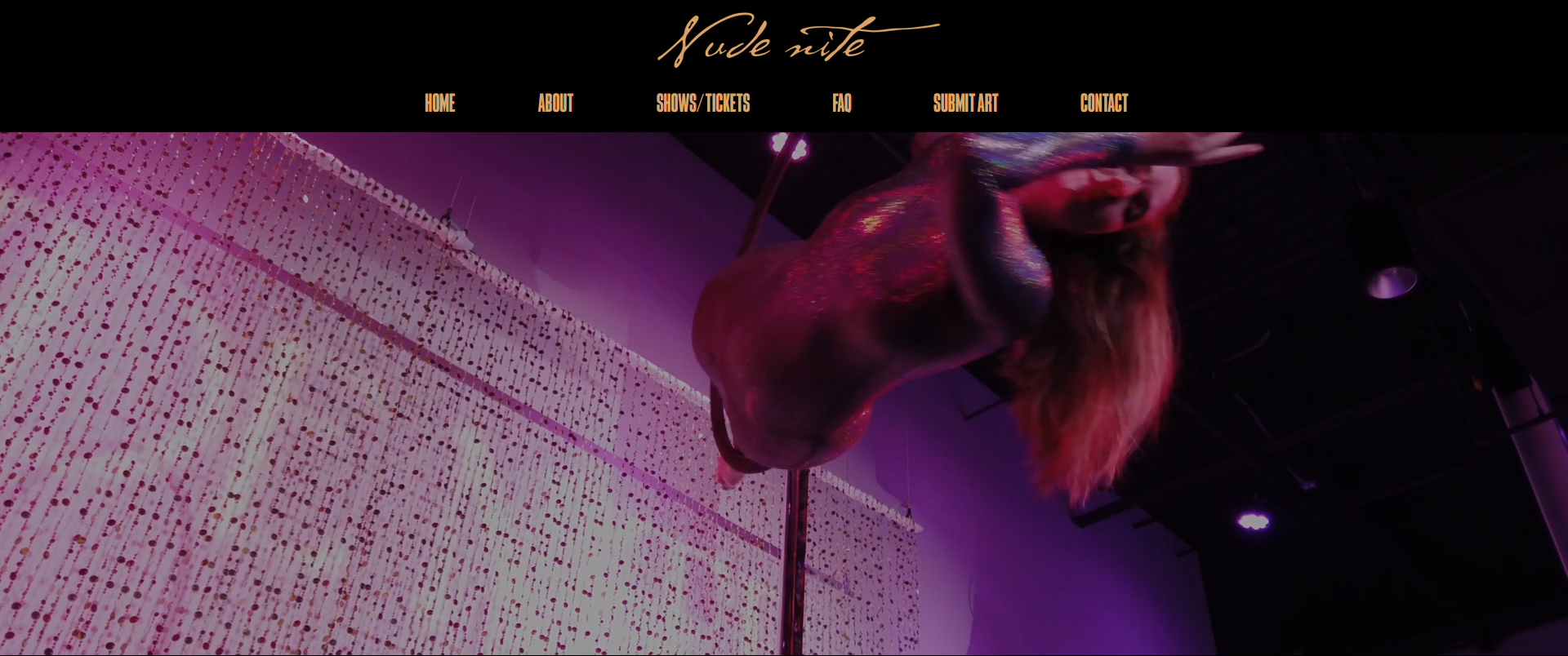
Nude Nite in Tampa and Orlando announced their submission deadlines. It has long been a goal of mine to be a part of that show. Many of my friends have been in it in the past, including Mark Williams and Casey "EnTactus" Wullner.
My pieces have had me researching old religious icons and church Slavonic scripts, because I cannot do things halfway. I'm trying to find the energy and inspiration to carry me through the painting process.
I believe at this point I have 55 to 60 days left. Wish me luck.
The Stupid, Stupid Life of a Pro Artist

Color has been on my mind lately.
The way we communicate color says a lot about how imperfect communicating all ideas is. People say goofy words like "Spruce" or "Periwinkle" and these are only ballpark generalizations on what the desired color communicated actually is.
Sometimes these generalizations are good enough. But if you're a printer, or someone else making finished products, color needs to be a bit more precise. If you have to solve a color problem, it can be challenging to communicate the idea of a color from one mind to another.
Many years ago, I was creating a shirt program for the Grand Canyon tourism group. The buyer had relayed to the company owner that they wanted the Canyon to appear in its trademark "Rose" color.
The owner, refusing to look at color samples, angrily decided the best way to communicate how the color "Rose" looked was to get louder and louder, yelling the word "Rose" at me.
"ROSE!" he yelled, "MAKE IT ROSE!"
"That doesn't tell me shit," I told him. I loathed yelling at employees, but company owners who yell at me don't deserve that reservation. "You might as well say 'make it Harfl-ti-blu' because you're not telling me anything helpful."
This is the problem with these stupid color names. People think they're saying something very specific. "Meet me at The Bean," they say. But it's more like you're saying it to someone who not only isn't in Chicago, they've never lived in the US and don't know what 'Chicago' even IS. And "The Bean" isn't one landmark but a vague general area that is somehow different for every person. It's literally that bad.
That owner refused to look at pantone chips and pick a color. After some thinking, my solution was to print multiple samples matched to Pantone colors, and letting the customer pick the one that represented "Rose" the best.
Their vague wording got us part of the way there, but Pantone got us the last mile.
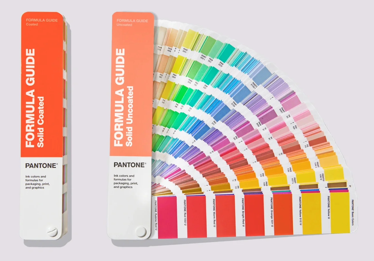
The Pantone Matching System, which has the unfortunate acronym "PMS," is a solution for professional printers and color matches. It's fine for what it is. Pantone is a private company, but in a professional world of color, a professionally produced book of labeled and numbered color chips is probably the only way to truly communicate ideas. They're a set of rails based in real color and real objects, unlike digital color and all of its caveats.
Computers, for instance, feel like they produce accurate color. They have numerical values, and numbers always feel very accurate. But! There's so many layers of interpretation going on that most people don't even know are there.
We call these interpretations color profiles and we have them for both monitors and printers. Ideally you want what's on your monitor to match what comes out of your printer. Getting those two things to work in lockstep is called having them "calibrated."
It's even further complicated because art files have color spaces and color profiles attached to them! Talk about untrustworthy.
(Many people will load the PMS color book on their computer, pick a color there, only to find the representation on screen doesn't match the actual swatch in an actual physical book. The screen inherently can't be used to match colors accurately. Don't do this if you can avoid it!)
Colors in physical spaces have properties we can't replicate on a computer screen. Is it glossy, glittery, matte, dull, holographic? Does it reflect or absorb light? Do the colors around it affect its color? Does the substrate? Does it look different printed on top of white paper, white ink, or embroidered with a different weave?
It likely will never change as long as goods are produced in color. We will always have customers and bosses yelling "ROSE" until they're blue in the face, as we try to walk them towards the right solution.
Media Recommendations
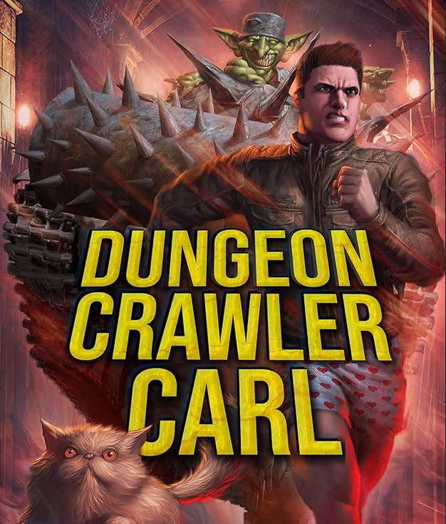
I recently finished "Dungeon Crawler Carl" after not having read much fiction or prose in quite some time. It's great, laugh out loud funny, and heartbreaking in a very unexpected way.
It manages to flip-flop from deadly serious and almost maudlin to so goofy and over the top it is hard to take seriously. The book starts with the complete unnecessary destruction of all life on earth, and then thrusts the main characters into a reality TV show killing goblins and pig-men. It's violent and weird and is a real blast. I'll be reading the whole series.
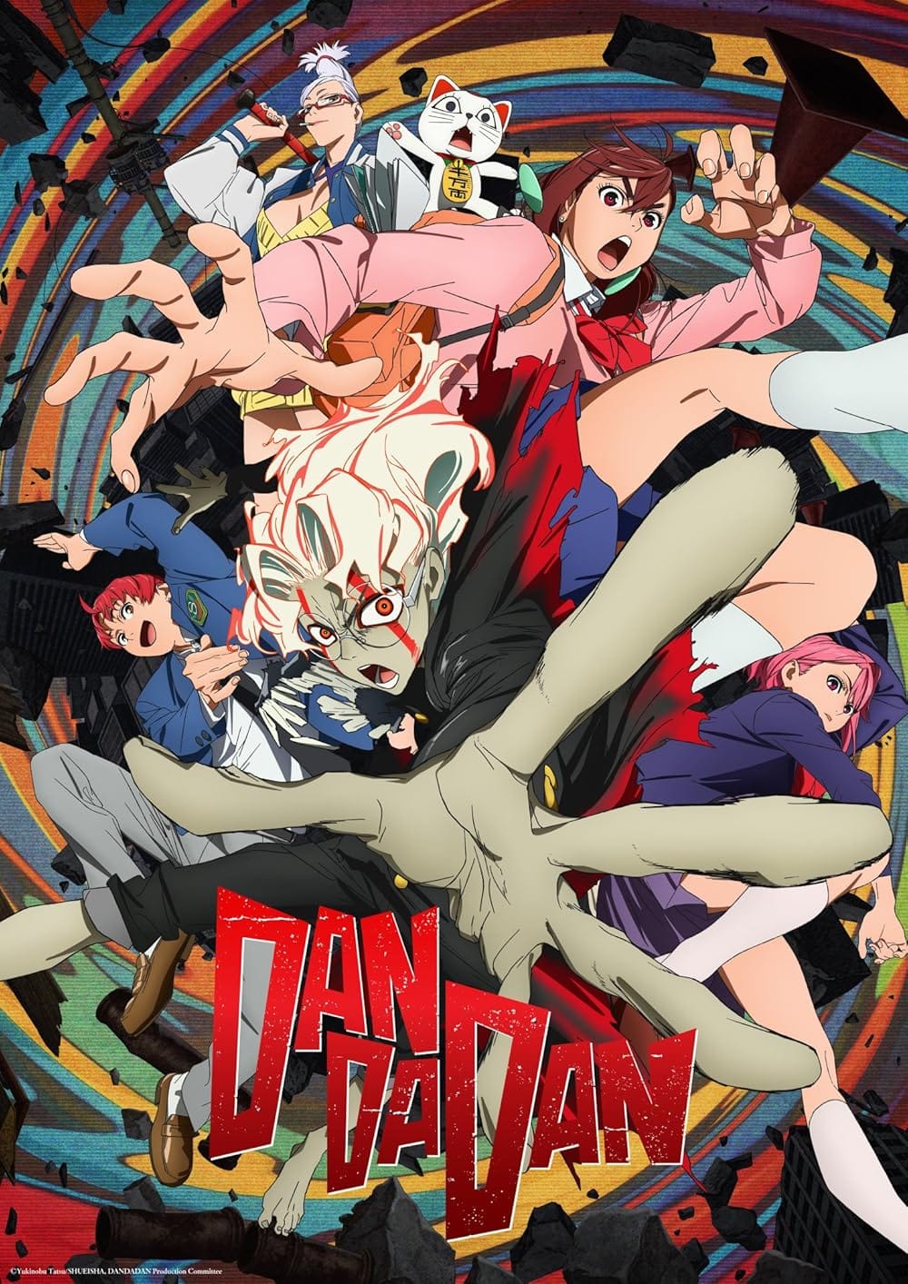
If you aren't watching or reading Dandadan, it's fantastic fun, if not an incredibly obvious recommendation. Anime and Manga feel like they are written much better after the era of One Punch Man. Dandadan seems to take inspiration the other title from OP Man's creator, Mob Psycho 100. It has a similar "Psychics versus Yokai (Japanese Ghosts)" conceit to it.
It is a fusion of Shonnen Battle Manga but with a young romance storyline weaving it all together, and I like that a lot.
I am not sure what is driving Anime to focus more on writing, but I am glad for the shift.
You can watch Dandadan on Crunchyroll, and/or read it on Shonnen Jump for a paltry 3 dollars a month.
EZG Merch
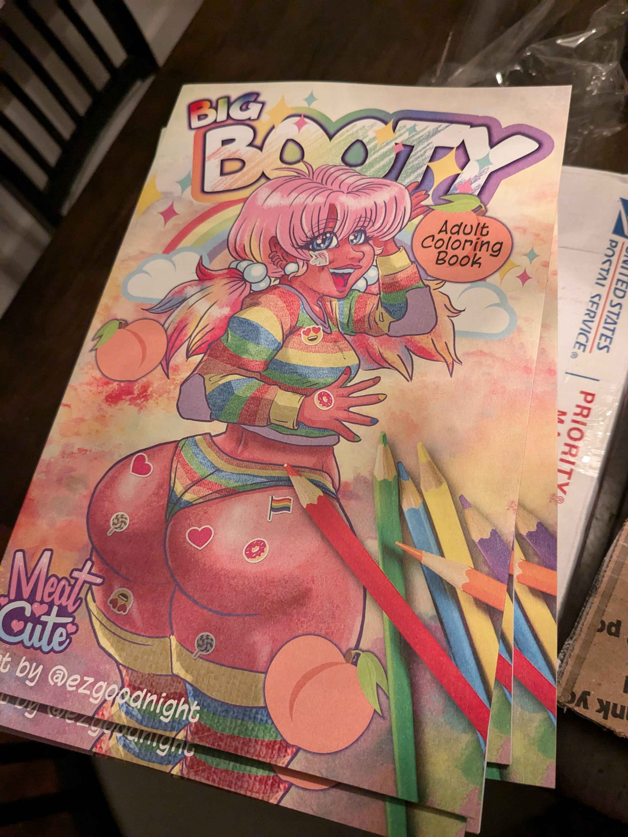
photos by Robbie Dorman
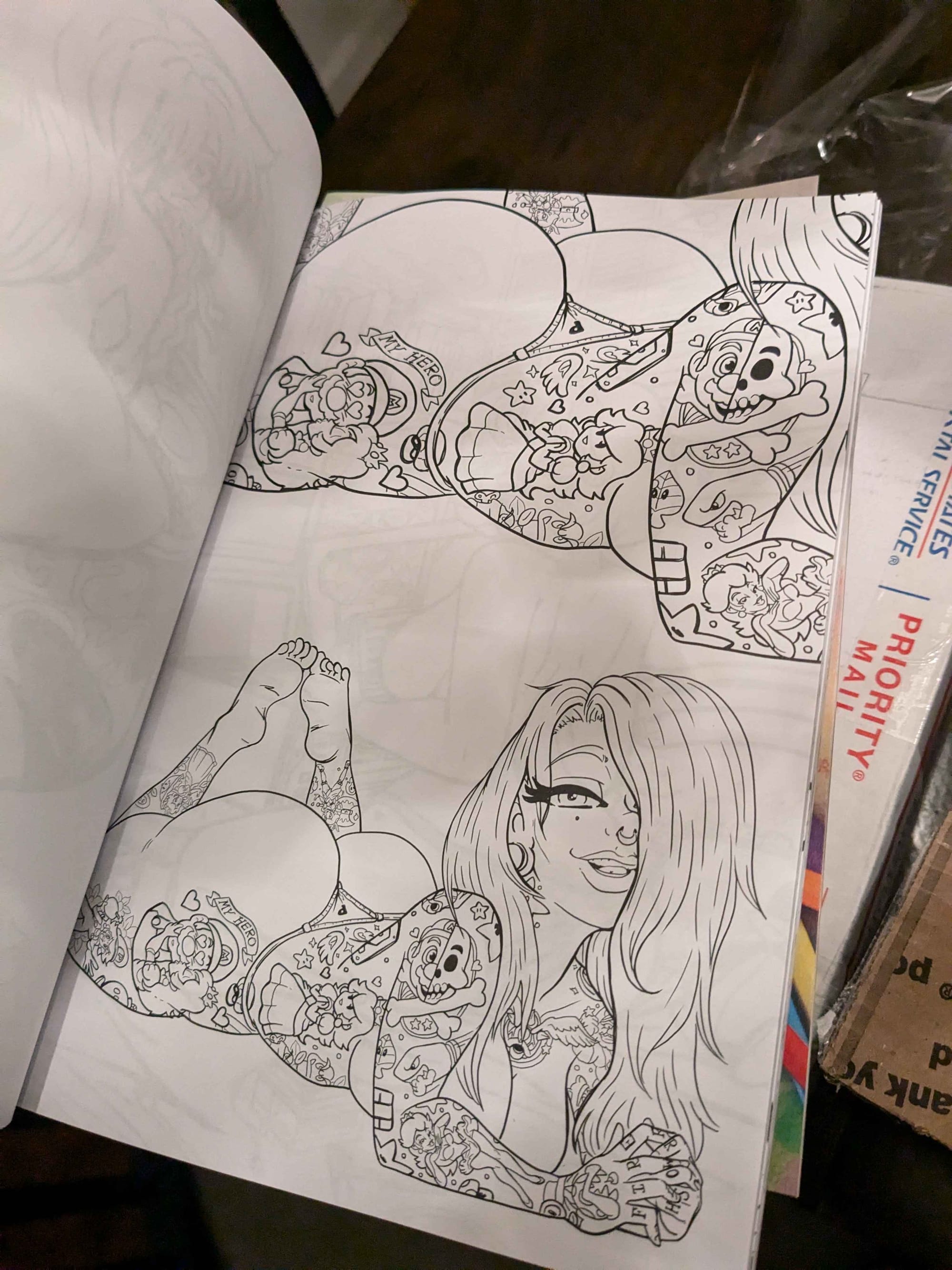
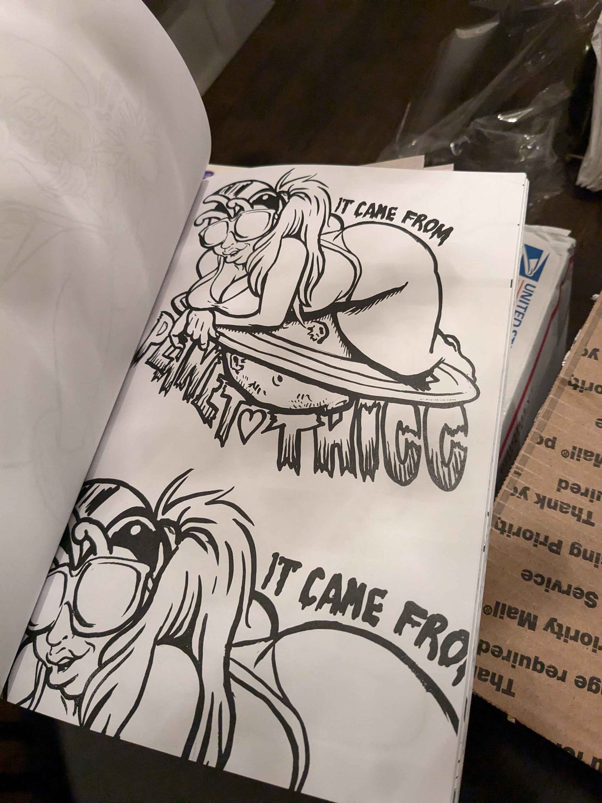
A run of my coloring books have been completed, originally for Spooky Empire. If you want first crack at them, they are going for 25 each. And for those of you that don't want to color them, this is a printed artbook from me with multiple images for the cost of a single print.
Anything on the site that isn't already poster size is available as an 11 x 17 print for 25 plus a little shipping. This includes the new Spooky images up above. Reply to this email and I'll help you with an order.
If you haven't already clicked through, you can view the new site at https://www.ezgoodnight.com
